
Benalytics: Your Reporting Dashboard
Benalytics gives you a detailed view of your program, letting you drill into specific metrics, compare performance over time, and export reports to share with HR or leadership.
If you want more detailed insights, here is how to go to the reporting dashboard.
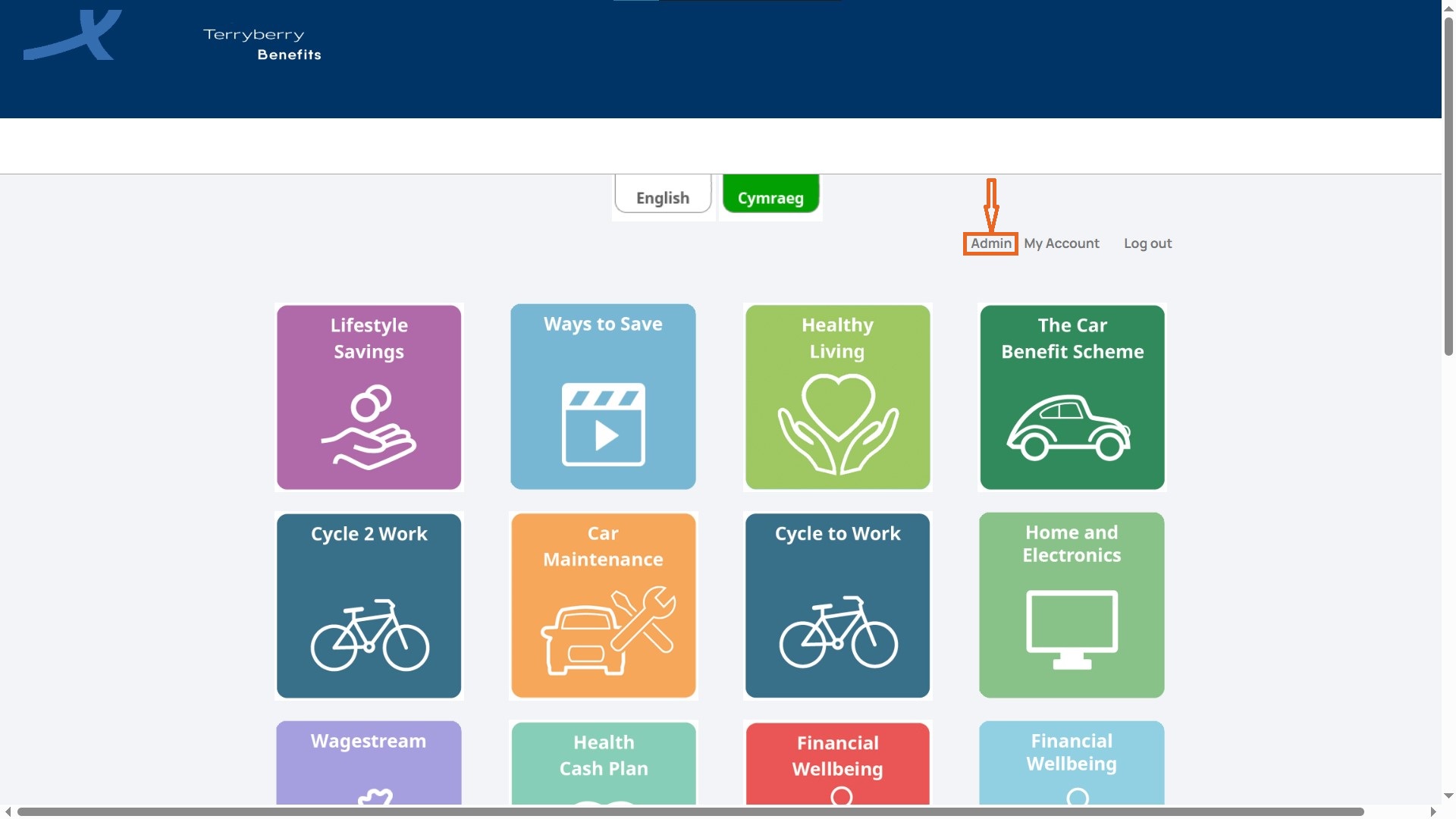
- From the Benefits Hub homepage, click on 'Admin' in the top navigation bar.
- On the landing page (Dashboard), click the Analytics Dashboard button.
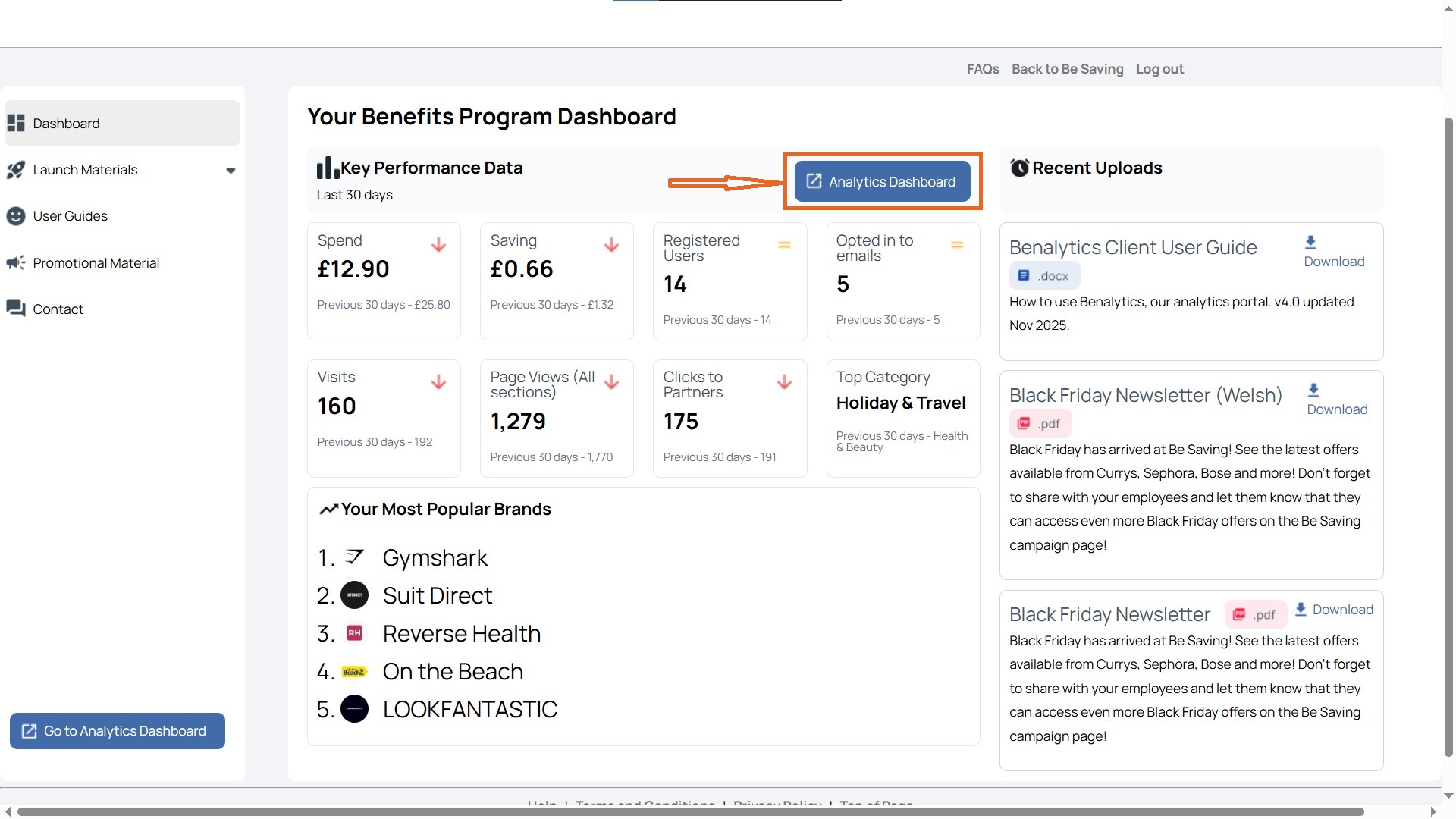
- You’ll be redirected to Benalytics, the in-depth reporting tool.
How to Use the Benalytics Overview
Track registrations, engagement, and savings in one place.
Here’s how to use it:
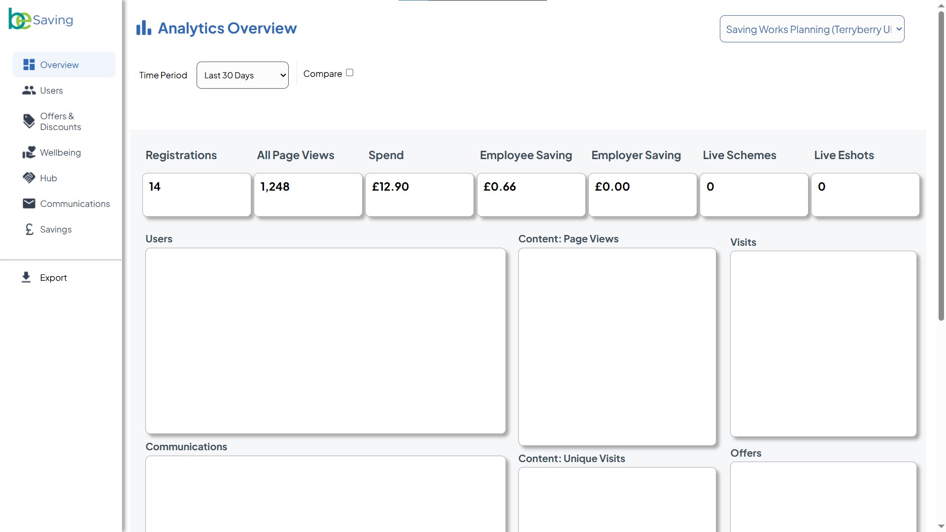
Select Your Time Period
At the top of the page, use the Time Period filter (default: Last 30 Days) to choose the window you want to review.
- You can look at recent activity (e.g., last 7 days) or zoom out for longer-term trends.
- Tick the Compare box to view performance against a previous period.
Review the Key Metrics Bar
Across the top, you’ll see a summary of your programme’s core data points:
- Registrations – How many employees signed up?
- All Page Views – The total visits to your Benefits Hub.
- Spend – The total value of purchases made through the hub.
- Employee Saving – How much employees saved by using the hub compared to retail prices.
Employer Saving – Any cost savings directly benefiting the employer. - Live Schemes – The number of benefit schemes currently running.
- Live Eshots – The number of active promotional emails.
Tip: Use these numbers as your “at-a-glance” health check for programme adoption and engagement.
Explore the Visual Charts
The dashboard includes graphs and charts to help you dig deeper:
- Users (bar chart): Shows your audience breakdown — total invited, registered, and opted-in for emails.
- Content: Page Views (pie chart): Breaks down which areas of the hub are most popular (e.g., Offers & Discounts, Benefits, Wellbeing).
- Visits (pie chart): Shows how employees are accessing the hub — via website or app.
- Communications (bar chart): Tracks email performance, including sends, opens, unique opens, and link clicks.
- Content: Unique Visits (pie chart): Highlights how many unique users are engaging with Offers & Discounts, Benefits, or Wellbeing.
- Offers (bar chart): Summarises live offers, total page views, clickthroughs, and unique codes requested.
Best Practices for Trends & Gaps
- If registrations are low, consider promoting the hub through email or team communications.
- If most page views are in Offers & Discounts, think about whether other benefit areas need more visibility.
- If savings look small compared to spending, employees may not be making the most of available offers.
If visits are all from the website, you may want to encourage app adoption for easier on-the-go access.