
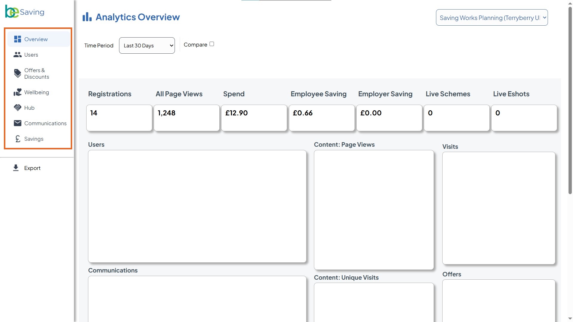
Explore Benalytics Features
 Users Tab
The Users tab helps you understand who is engaging with your benefits program and how. It combines charts, graphs, and detailed data tables so you can track overall audience size, monitor registration progress, and spot trends in how employees are interacting with your platform.
What you’ll see here:
- Users (pie chart): Shows the split between active and inactive users.
- Website and App Visits (pie chart): Breaks down access via web browser vs. app.
- User Activity (line graph):
- Switch between tabs like Registration Data, Email & Notifications, Session Activity, and Website/App Activity.
- Track metrics such as registered users, inactive users, active users, and blacklisted users over time.
- All User Data (table): A detailed breakdown including:
- Audience reach
- Number of registered users
- Opt-ins (emails, offers, benefits partners)
- Snoozed preferences (offers/partners)
Best Practices
- Look for trends, not just numbers. For example, a sudden spike in inactive users might signal a drop in engagement, while a steady climb in registrations shows growing adoption.
- Compare web vs. app usage. If most traffic is web-based, consider reminding employees about the app for easier access.
- Use activity tabs to dig deeper. Switching between Email & Notifications and Session Activity can show whether low usage is tied to poor communication or a lack of interest.
- Cross-check with the data table. The “All User Data” section confirms whether opt-ins and registrations align with the charts.
- Track over time. Use the date range filter (e.g., “Last 30 Days”) to compare short-term campaigns versus longer-term adoption.
Offers & Discounts
You can view this section by selecting 'Offers & Discounts' in the sidebar. It shows how employees are interacting with the discounts available in your hub.
What You’ll See
- Filter Area (dropdown menus): At the very top, you can refine your view using filters for Category, Suppliers, Offer Type, Offers, and whether an offer includes a code. These filters adjust all the data below to show only what’s relevant to your selection.
- Offers and Discounts Data (summary table): This is the first section you’ll see. It shows totals for page views, offer views, unique offer views, click-throughs, favourites, wallet adds, and codes requested, broken down by scheme.
- Suppliers Summary (table): Lists individual suppliers (e.g., On the Beach, Ocado) and shows the same set of metrics, helping you compare supplier performance side by side.
- Offers Summary (table): Provides a row for each individual offer, showing detailed engagement like how many times it was viewed, clicked, favourited, or redeemed.
- Category Summary (table): Groups performance data by category (e.g., travel, groceries, fashion), letting you see which types of offers employees engage with most.
- Offers and Discounts Activity (line chart): Tracks engagement activity over time, helping you spot usage trends such as peaks around payday or special campaigns.
Best Practices
- Look for high click-through but low wallet adds/codes: This can mean employees are interested, but something in the redemption process is creating friction.
- Compare categories: See which benefit categories consistently perform well. This can guide which new partners or offers to promote.
- Check time patterns: Spikes in activity often align with payday or company communications—use this insight when planning future announcements.
- Favourites vs. usage: If an offer is frequently favourited but not redeemed, employees may be saving it for later—consider keeping it available longer.
Wellbeing
The Wellbeing tab helps you track engagement with wellness-related content and suppliers. This is where you can see how employees are interacting with resources designed to support physical, mental, and lifestyle wellbeing.
What You’ll See
- Filter Options (top bar): Apply dropdown filters for Supplier List, Pillar List (wellbeing theme), and Content type to refine your view.
- Wellbeing Data (table): Displays totals for key metrics such as page views, visits, unique visits, and clickthroughs.
- Suppliers Summary (table): Breaks down performance by individual partners.
- Wellbeing Activity (chart): A time-series graph showing activity trends across metrics like Page Views, Visits, Unique Page Views, Unique Visits, and Clickthroughs.
Best Practices
- Apply filters to zoom in: Narrow results by wellbeing pillar (e.g., fitness, nutrition, mental health) to see which content areas employees value most.
- Track engagement per supplier: Compare suppliers to identify which wellness benefits generate clicks and visits and which may need extra promotion.
- Use activity trends: Spot peaks or dips in the activity chart to understand when employees are most responsive to wellbeing initiatives.
Cross-check with comms: If engagement is low, align with your communications data to confirm whether employees are aware of the wellbeing offers.
Hub
The Hub tab shows how employees engage with the Benefits Hub content. This includes activity on different hub tiles and overall interactions with content. It gives you a clear view of which areas of the hub are being explored the most.
What You’ll See
- Hub Data (table): Breaks down metrics such as page views, visits, unique visits, and click-throughs for each scheme.
- Hub Activity (line chart): Displays trends over time for page views, visits, unique visits, unique page views, and click-throughs. Peaks in the graph indicate higher engagement days.
- Filters (at the top):
- Time Period: Choose the reporting window (e.g., Last 30 Days).
- Compare: Tick this box to compare the chosen time period against a previous one.
- Scheme selector (top-right): Switch between schemes if you manage more than one.
- Content filters (dropdowns): Depending on your setup, you may see dropdowns like Tile/Content Type or Category. Use these to refine which areas of the hub the data covers. Select All to reset the filter.
Best Practices
- Identify engagement patterns: Watch for spikes in the Hub Activity chart to see when engagement is highest, which may align with campaigns or internal comms.
- Compare visits vs. click-throughs: A high number of page views but low click-throughs may suggest the content isn’t driving deeper engagement.
- Track content interest: Use the table to see which tiles or schemes employees are visiting most, and use this to guide future benefit promotion.
- Check unique visits: Unique visit numbers give a better sense of how many employees are engaging, rather than repeat traffic inflating totals.
Communications
The Communications tab shows how employees interact with email campaigns (eshots). It tracks delivery, opens, link clicks, and spam scores, helping you measure the effectiveness of communications and identify how well employees are engaging with your messages.
What You’ll See
- Filter Options (top bar): Apply dropdown filters for Eshot Type, Segmentation, Eshot Audience, and specific Eshot campaigns to refine your view.
- Communications Data (table): Displays totals for emails sent, emails opened, unique opens, links clicked, live eshots, and spam score.
- Communications Activity (chart): A time-series graph showing activity trends across metrics like Emails Sent, Emails Opened, Unique Opens, Links Clicked, Live Eshots, and Spam Score.
- Detailed Campaign Rows: Provides campaign-by-campaign breakdowns, letting you assess performance at a more granular level.
Best Practices
- Apply filters to compare campaigns: Narrow results by segmentation or specific eshots to evaluate which communications resonate with different employee groups.
- Track open vs click rates: High opens with low clicks may signal strong subject lines but weak calls-to-action in the email content.
- Monitor spam scores: Keep an eye on the spam score metric to ensure your campaigns avoid deliverability issues.
- Look at activity over time: Use the chart to spot spikes in engagement after certain campaigns and identify the best times to schedule emails.
- Link back to benefits data: If clickthrough rates are low, cross-check with Offers or Wellbeing tabs to confirm if the issue is awareness or the offer itself.
Savings
The Savings tab highlights the financial impact of the program. It shows total spend, employee and employer savings, and average savings percentages over time. This gives you a clear picture of how much value employees are getting from offers and how the program contributes to overall savings.
What You’ll See
- Filter Options (top bar): Select a specific Time Period Year or compare against another year to track savings over time.
- Savings Data (table): Displays totals and month-by-month breakdowns of spend, employee savings, employer savings, and average savings percentages.
- Suppliers Summary (table): Highlights savings linked to specific partners or categories (e.g., tracked vs. untracked online offers).
- Savings Activity (chart): A time-series view of key metrics, including Spend, Employee Saving, Employer Saving, Employee Average % Saving, and Employer Average % Saving.
Best Practices
- Compare across years: Use the year comparison option to identify long-term trends in spending and savings.
- Spot monthly patterns: Track months where savings spike or dip, and check if these align with seasonal offers, campaigns, or holidays.
- Check average percentages: Focus on average % saving to understand the real value employees are gaining, not just the raw totals.
- Review supplier impact: If employer savings are at 0, cross-check with supplier arrangements to ensure opportunities are being fully leveraged.
Correlate with engagement: Compare savings activity with usage data from the Offers & Discounts or Communications tab to see if low awareness impacts savings outcomes.