
Individual Survey Reports
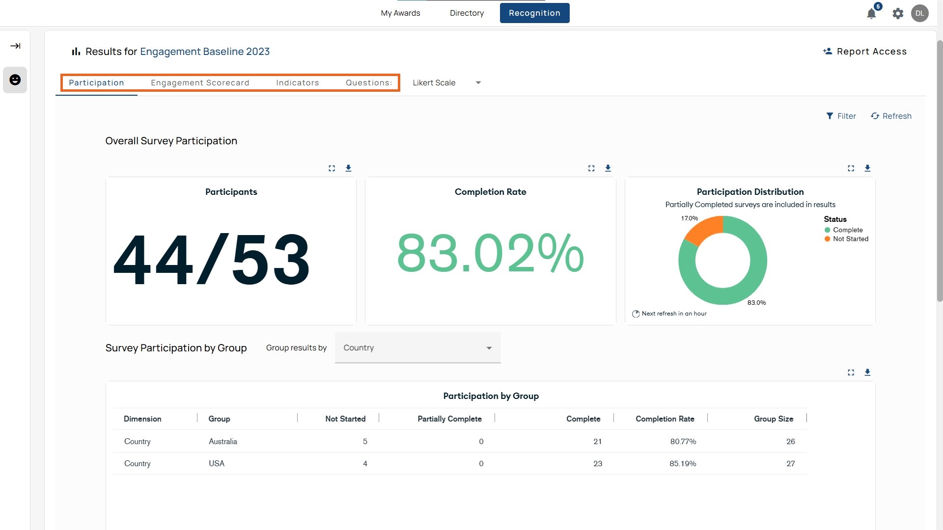
Participation
The Participation tab shows completion results and where participation lags. It’s the first page in the survey report.
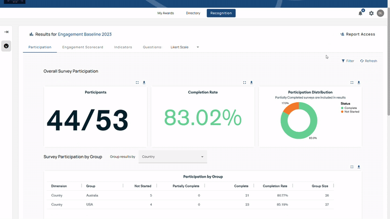
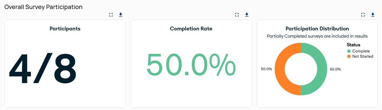
Overall Survey Participation
- Completion Rate: Percentage of employees who submitted responses.
- Survey Participation Bar: Visual scale from 0%–100%.
- Green: Complete
- Magenta: Partially Complete
- Orange: Not Started
Survey Participation by Group
Results can be grouped by categories such as department, age, or country. The table shows:
- Dimension: The category (e.g., Department, Country)
- Group: The specific value within the category (e.g., Sales, Canada)
- Not Started: Invited but hasn’t opened or answered.
- Partially Complete: Started but didn’t submit; partial answers may appear in question-level results.
- Completed: Finished and submitted.
- Completion Rate: Completed ÷ Group Size (percentage).
- Group Size: Total eligible participants in the group.
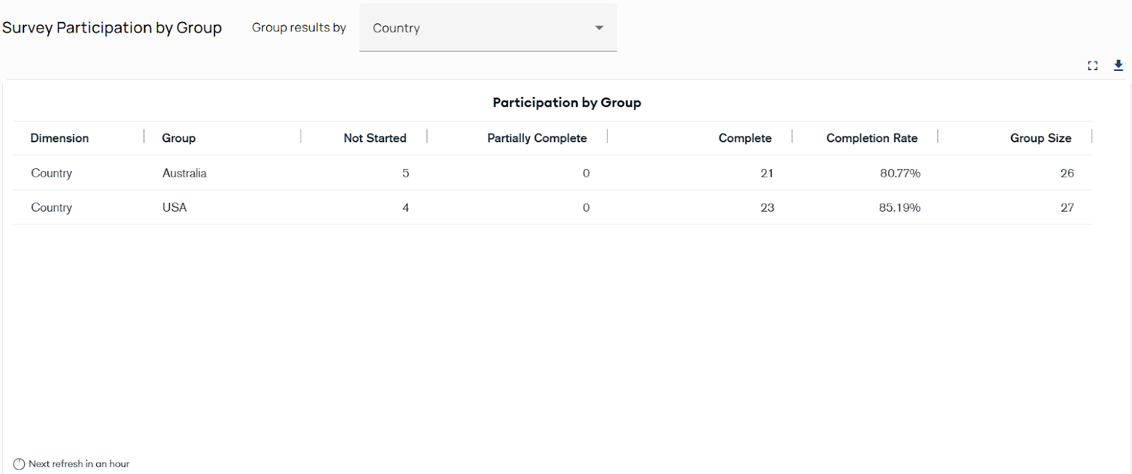
Note: Partial responses count in question-level reporting but not in completion rate.
How to Use Survey Participation by Group
- Locate the dropdown
Locate “Group results by” above the participation table (left side). - Open the dropdown menu and choose a category
A list of grouping options will appear — for example: Department, Country, Ethnicity, Employment Type, Gender, or Manager. - Select a category
When you choose one, the table below updates to show participation results for each group in that category (e.g., all departments side by side). - Review the breakdown
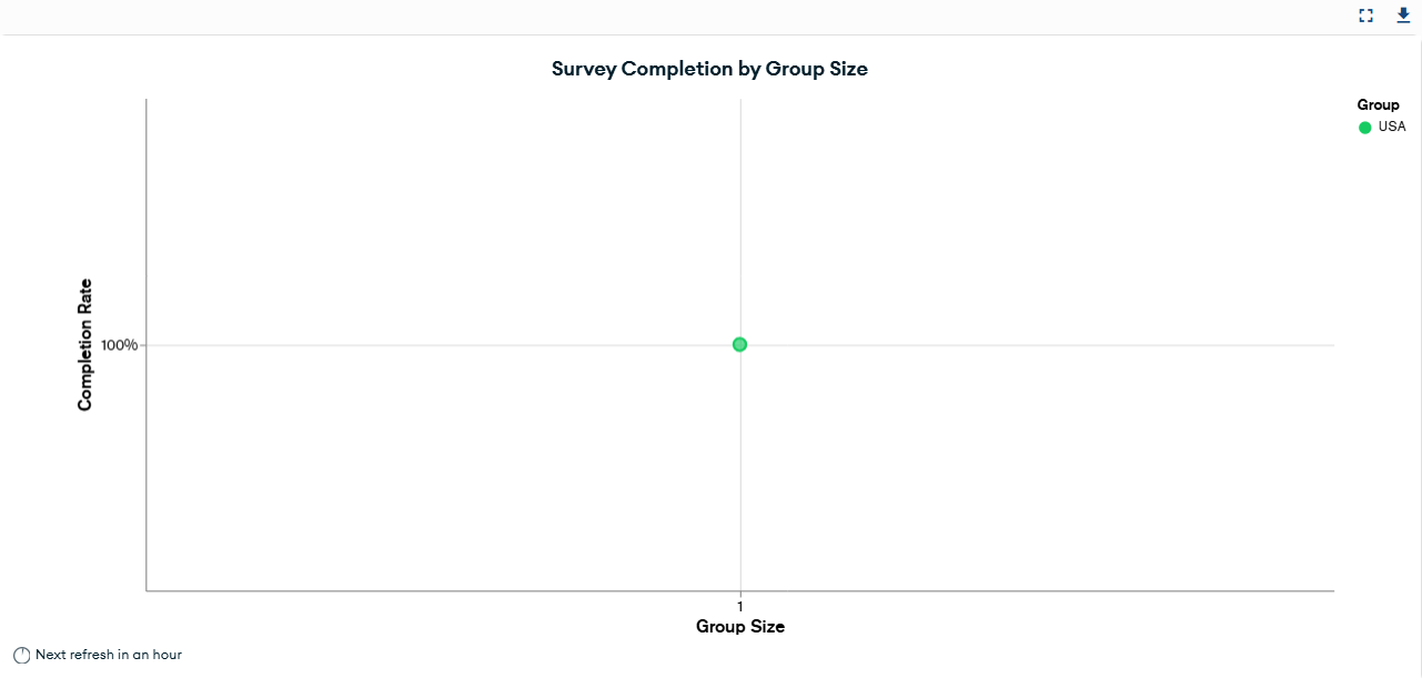
Each row shows Not Started, Partially Complete, Completed, Completion Rate, and Group Size for that group. You can also use the Survey Completion by Group Size to gain more insight into participants who finished their survey.
Group vs. Filter
Grouping and filtering produce different result views; understanding the difference ensures accurate interpretation of survey data.
Groups
- Created by Admins or Managers.
- Show results for an entire category (e.g., all Departments side by side).
- Example: Selecting “Department” as a group shows participation rates for all departments side by side.
Filters
- Narrow results to one or more values within the selected group.
- Example: Filtering by “Sales” within the Department only shows the Sales team’s results.
- Filters persist across tabs.
Tip: Use Groups for comparisons; use Filters to drill into a single team or attribute.
How to Use Filter
- Locate the button.
The Filter button is at the top right of the page, next to Refresh. - Click Filter (top right).
A search box appears on the right, allowing you to choose specific values within the group you’ve already selected—or filter independently without grouping. - Search and select value(s)
For example, if you grouped by Department, you can filter to only show Sales or Marketing. You can also apply filters on their own to focus on specific segments without using the Group function. - View filtered results.
The dashboard refreshes to display only the selected values. - Check other tabs.
Filters remain active as you move into other views (like Engagement Scorecard or Questions). Keep an eye on which filters are applied. - Clear when needed.
Clear filters to reset.
Important: You filter by values within a group (e.g., Sales), not by group names (e.g., Department).
Best Practice Tip: Use Groups for big-picture comparisons (e.g., which department had the highest participation). Use Filters to look deeper into a single team or attribute (e.g., how employees within a single department responded).
Engagement Scorecard
The Engagement Scorecard combines four areas—participation, sentiment (eNPS), retention, and engagement indicators, all on one page. This view helps you understand not just how many people responded, but also how they feel and what that means for the organization.
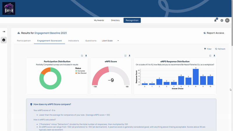
At the top of the page, you’ll find:
- Participation Donut Chart: Shows employees who completed vs. did not start the survey.
- eNPS Score: -100 to 100 scale.
- eNPS Response Distribution: Bar chart showing how employees rated the likelihood of recommending the organization (0–10 scale).
Further down, you’ll see:
- Retention: Pie and bar charts for expected tenure ranges.
- Indicator Scores: Bar graphs showing performance across key categories like Purpose, Belonging, Leadership, Equity, Empowerment, and Well-Being.
- Headline Metrics: Three headline metrics—Engagement Score, Likert Average, Positive Sentiment—that normalize responses and highlight sentiment strength.
- Indicator Questions: A detailed table showing each question, its Engagement Score, Likert average, percentage of positive responses, and how it compares to the company average.
How to Use It
- Click the Engagement Scorecard from the report tab menu.
- Review top-level cards and graphs for participation, eNPS, and retention.
- Check indicator scores to identify which cultural dimensions are strongest or weakest.
- Examine the question table to identify which items contribute to each indicator.
- Apply filters by department, country, or other groups.
- Export data for sharing.
Tips
- Use Insights to spot hidden clusters of detractors or promoters.
- Retention charts are presentation-ready—export or screenshot.
- Cross-check Engagement Score and eNPS; scales are comparable.
- Positive Sentiment below an industry benchmark indicates disengagement risk.
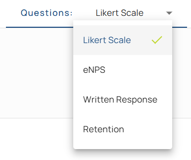
Questions
The Questions tab shows results by question type. The dropdown lists only the types used in that survey.
Likert Scale Report
The Likert Scale report shows agreement-scale results (Strongly Agree → Strongly Disagree) across leadership, belonging, purpose, and other areas.
At the top of the page, you’ll see:
- Likert Response Average → Likert Average (1–5): 1–2 negative, 3 neutral, 4–5 positive.
- Response Distribution Chart Table → Lists each question with its linked indicator (e.g., Belonging, Leadership). Includes:
- Engagement Score (scaled to -100 to 100)
- Likert Average (1–5 scale)
- % Positive (Agree/Strongly Agree)
- Comparison to survey average
The snapshot summarizes results before you dive into question-level detail.
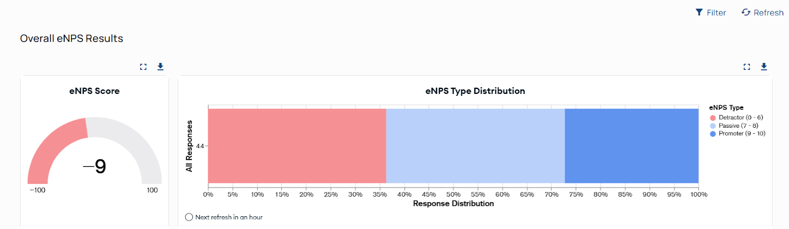
eNPS Report
The eNPS report tracks sentiment using the Employee Net Promoter Score (eNPS). It asks one key question: “On a scale of 1-10, How likely are you to recommend this company as a place to work?”
At the top of the page, you’ll see:
- Overall eNPS Score: Overall eNPS Score = % Promoters − % Detractors (Passives excluded)
- Response Distribution: Visual split of Detractors (0–6), Passives (7–8), Promoters (9–10).
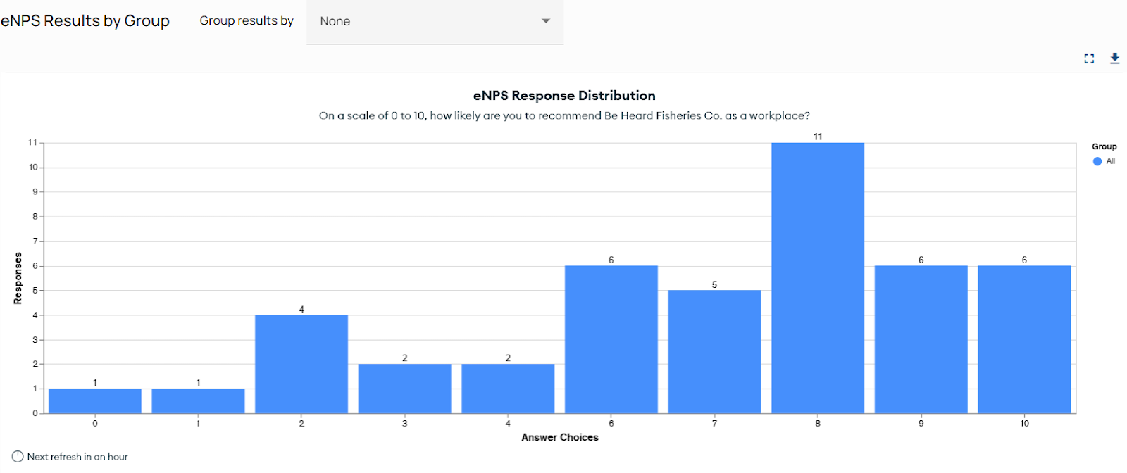
eNPS Results by Group
Use the “Group results by” dropdown to break down eNPS responses by attributes such as department, country, or employment type.
- Without grouping, you’ll see a simple bar of 0–10 responses.
- With grouping, the bar stacks to show which groups contributed to each score.
Response Distribution
The bar chart below the score shows exactly how many employees chose each number from 0 to 10.
- Example: If 29 employees chose “7,” you’ll see a tall bar at that point.
- In a grouped view, this same bar will show how different groups contributed to the total responses.
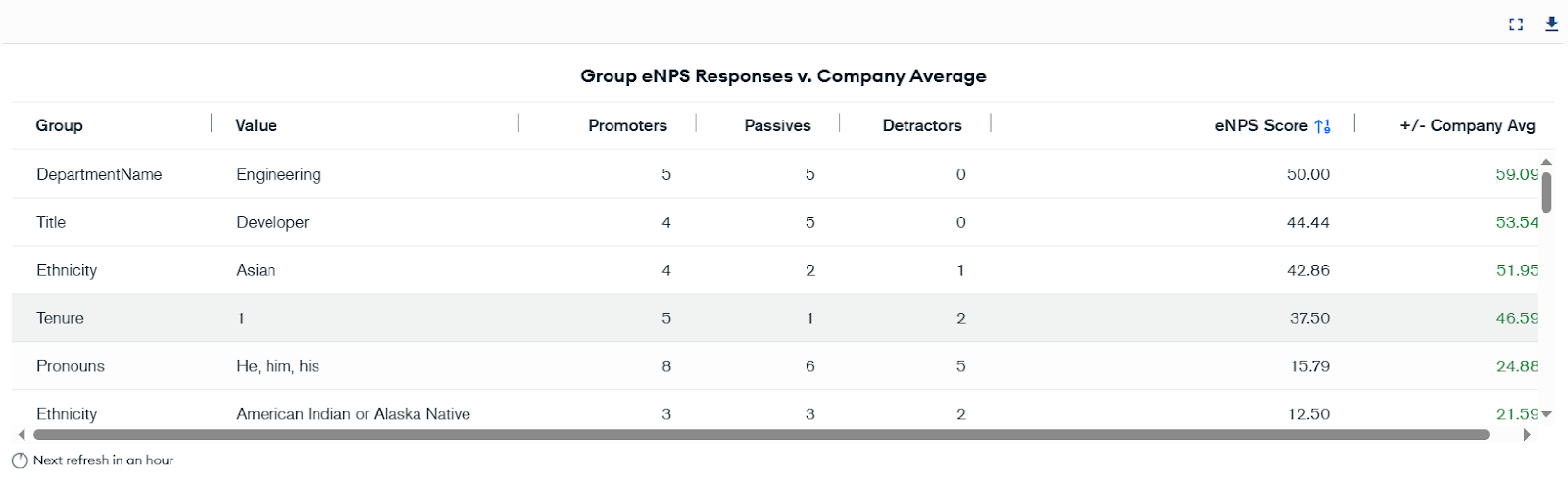
Group Comparisons
At the bottom of the dashboard, you’ll find a comparison table:
- Group Comparisons list each group with Promoters, Passives, Detractors, the group’s eNPS, and variance from the company average.
Written Response Report
The Written Response report displays answers to open-ended survey questions. Comments add context to numeric results and explain the “why.”
At the top of the page, you’ll see:
- Written Responses Table: Individual answers, included with eNPS type (Promoter, Passive, Detractor). This adds context by showing whether comments are coming from engaged advocates or less satisfied employees.
- Most Common Words Cloud: Word cloud shows frequently used terms; use as a quick theme preview, not a replacement for reading comments.
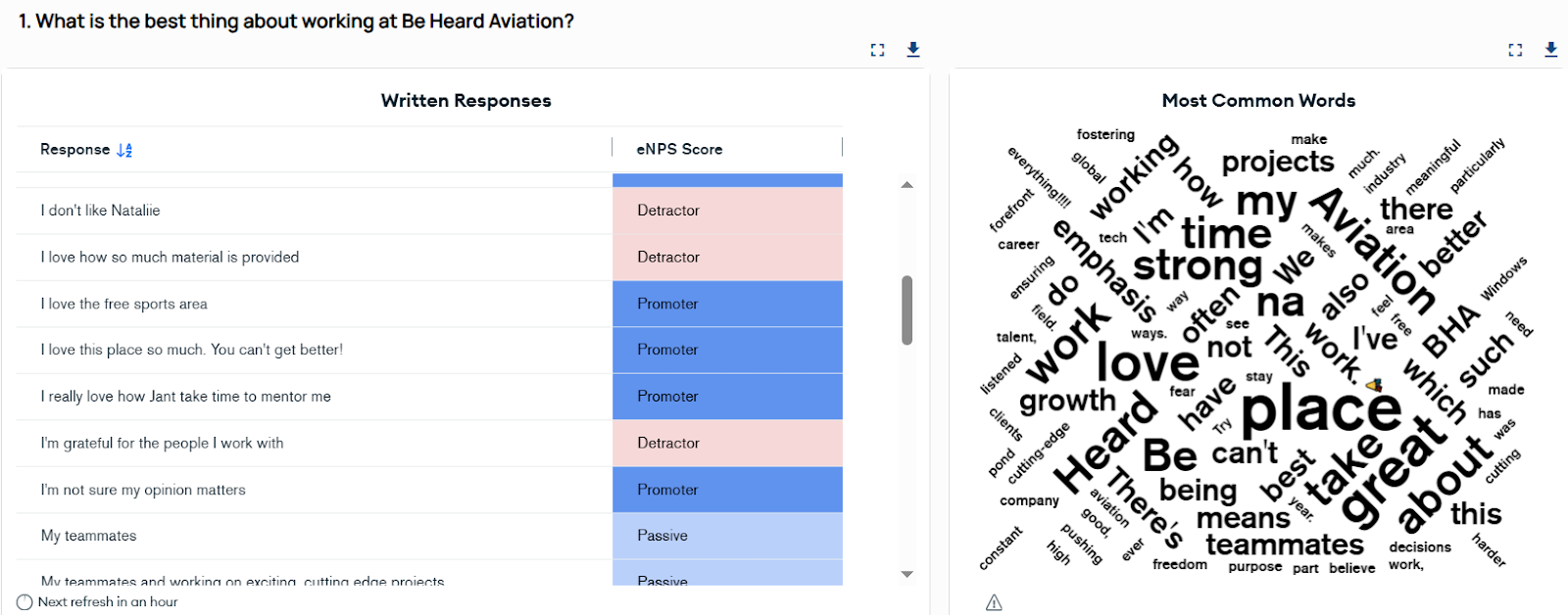
Written Responses Table
- Displays each comment exactly as submitted.
- Shows if comments are coming from engaged promoters or detractors.
- Examples help you spot patterns, e.g., promoters praising “coworkers,” detractors flagging “workload.”
Export Options
- Export to CSV or XLSX for deeper analysis.
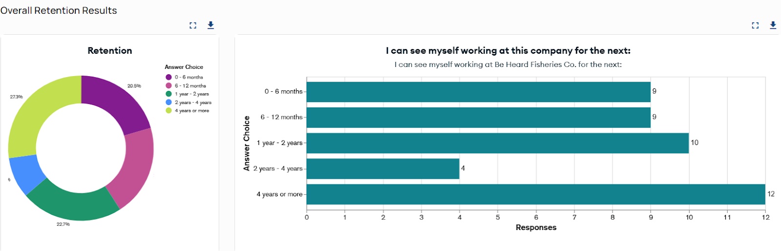
Retention Report
The Retention report shows how long employees expect to stay, helping you anticipate turnover risk.
At the top of the page, you’ll see:
- Donut Chart: Shows overall distribution of responses across tenure ranges (e.g., 0–6 months, 1–2 years, 3–4 years, 4+ years).
- Bar Chart (Response Distribution): Breaks down how many employees chose each tenure category for specific retention questions.
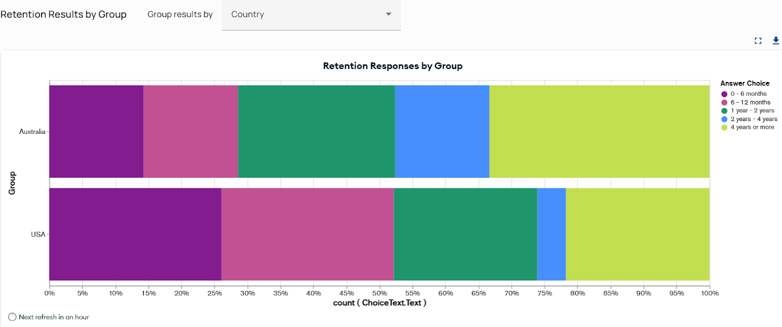
- Stacked Bar by Group: Group comparisons (e.g., countries, departments, employment types).
Retention Results by Group
Group results by dimensions (e.g., Country, Department, City, Employment Type) to see where shorter tenure expectations cluster.
Indicators
The Indicators report rolls individual questions into six engagement dimensions: Belonging, Empowerment, Equity, Leadership, Purpose, and Wellbeing. In charts, these Culture Indicators are standardized to display all standard indicators first in alphabetical order, followed by any custom indicators in alphabetical order.
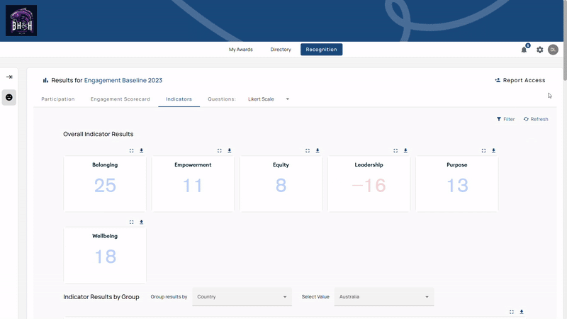
At the top of the page, you’ll see:
- Overall Indicator Results → Cards with scores per dimension (refresh hourly).
- Indicator Results by Group → Compare by department, city, country, or other attributes.
- Indicator Insights Report → Automatic summary of strengths and opportunities.
Overall Indicator Results
- Each card shows the indicator score for one of the six Culture Indicators.
- Higher scores = stronger performance. Lower scores = opportunity areas.
- Example: Empowerment = 14 (strong) and Wellbeing = 2 (low). The cards show where to focus. (standardized “Wellbeing”)
Indicator Results by Group
- Group by a dimension to compare bar charts across the six Culture Indicators; color-coding maps to Strongly Agree → Strongly Disagree.
- Example: Viewing the “Implementation” department shows how that group scored on all six indicators. This allows comparisons across teams and surfaces pockets of strength or challenge.
Results by Indicator
- Select a single Culture Indicator (e.g., Belonging) to see scores across groups and view related questions.
- Example: Selecting “Belonging” reveals whether employees feel included and connected, with the option to view all related survey questions. This provides a focused lens on a single dimension of engagement.
Indicator Insights
- Indicator Insights automatically highlights top strengths and biggest opportunities, by role, manager, or department.
- If scores are high, Insights highlight your top-performing roles, managers, or departments, while still noting what areas might have challenges.
- If scores are low, Insights shifts to spotlight the weakest areas while still noting what’s working well.
- Example: Examining the Empowerment Culture Indicator might highlight that Sales Reps scored 100 while IT Managers scored 17, flagging an area to watch. This saves leaders from manual number-crunching and points them directly to actionable takeaways.
Key Metrics Explained
- Participation Rate: Percentage of invited participants who completed the survey.
- eNPS: Measures employee advocacy by subtracting the percentage of Detractors from the percentage of Promoters (excluding Passives). Teams use it to compare engagement levels internally and against industry benchmarks.
- eNPS Distribution: Spread of 0–10 responses.
- Retention Score: Expected tenure ranges; useful for spotting turnover risk.
- Engagement Indicator Scores: Aggregated Likert results for each of the six Culture Indicators.
- Engagement Score: Converts Likert results to the −100 to 100 scale, comparable with eNPS.
- Likert Average: Average across Likert questions (1–5). Above 3.0 indicates a positive lean.
- Positive Sentiment: Percentage of Agree/Strongly Agree responses.
- Engagement Indicator Questions: Individual questions, sortable by indicator for deeper analysis.
Tip: Use the download icon on each card to export just the data or visual you need.